Preface
This post is going to cover a different topic than the ones I’m used to talk about. It comes as a direct result of me trying to find the best Japanese fonts to use that would also match the slick Courier monospaced font I use for Latin characters throughout the site.
This post serves mostly as self-documentation. I don’t expect it to be tremendously useful for the average geek building their own static website —I know I’m in a weird niche after all— although I really hope it serves as an interesting reading and a little piece of trivia for those curious enough to read about typographies for languages of the squiggly variety.
Little introduction to Japanese
Japanese uses three different methods of writing: hiragana, katakana and kanji. The first two ones are syllabaries, with each character representing a sound. The latter is a Chinese legacy and uses Chinese characters to convey whole meanings for words; a logogram. These three different methods are usually combined together to form sentences. For instance, the sentence
My name is Kagayakuhari
can be written as:
Hiragana and katakana each have 46 different symbols, while kanji has 2000+ symbols covered in basic education only, with a grand total of over 50000 characters. Compared to the 20 odd letters the Roman alphabet has, this makes creating usable Japanese fonts a tad more difficult.
Typographical differences
Latin characters are single-byte while Chinese, Korean and Japanese characters are double-byte. This is due to the fact that you need double the space to properly store and render the hundreds of characters these languages need. Unicode came as the big unifier with the possibility to have four-byte characters, although “legacy” characters like Roman letters and CJK symbols were kept as single and double-byte, respectively.
When it comes to fonts, pixel real estate is very important. As you may have already guessed, on average, Japanese symbols require double the area a Latin character would need in order to be legible. This issue is especially notable in retro games, where limitations in screen resolution posed a serious problem when rendering eastern glyphs.
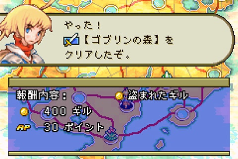 Screenshot from Final Fantasy Tactics Advance.
Hiragana is rendered okay but kanji readability is suboptimal.
Screenshot from Final Fantasy Tactics Advance.
Hiragana is rendered okay but kanji readability is suboptimal.
Final Fantasy Tactics Advance uses a 10 x 14 pixel grid to represent all their characters. This is fine for Roman letters but kanji readability is severely affected in comparison. You can find the entire font in the Final Fantasy Hacktics wiki page.
The problem
Most of you would’ve already realised that Japanese fonts —and Chinese and Korean ones— must weigh a lot. For instance, Google’s Courier typeface font Courier Prime weighs just shy of 300 kilobytes. A somewhat complete, variable, pure Japanese font such as Microsoft’s MS Mincho weighs up to five megabytes. Google’s all encompassing Japanese font Noto Sans Japanese weighs almost 60 megabytes, while its international counterpart stands at 45 megabytes.
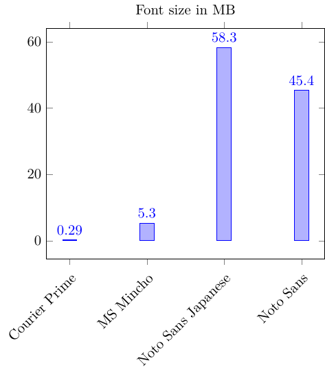 Visual size comparison between the aforementioned fonts.
This makes loading custom Japanese fonts on websites extremely inefficient and slow. Just imagine having to download a 50 megabyte pack of fonts every single time you visited this site. That’d be awful. Nobody wants that. Luckily for the internet, the Japanese don’t seem to care much about fancy fonts for daily use, defaulting to the already pre-installed fonts in their devices. In fact, web results for Japanese web safe fonts are nonexistent, only covering Latin fonts. Unluckily for me, however, that means no fancy Japanese characters in here.
Most Japanese people use Windows as their desktop operating system, with iOS as their preferred mobile operating system. The default fonts in these systems aren’t bigger than four or five megabytes.
| Serif (Mincho) | Sans-serif (Gothic) | |
|---|---|---|
| Windows 11 | MS Mincho | MS Gothic, Yu Gothic, Meiryo |
| macOS 10.14 | Hiragino Kaku Mincho, Osaka, Toppan Bunkyu Midashi/Mincho, | Hiragino Kaku Gothic, Yu Kyokasho, Toppan Bunkyu Gothic |
| Ubuntu 22.04 | IPA/IPAex Mincho | IPA/IPAex Gothic |
| iOS 17 | Hiragino Kaku Mincho | Hiragino Maru Gothic |
| Android 12 | Droid Sans Japanese |
Default Japanese fonts in the international versions of the different operating systems.
Ultimately, these are the fonts I’ll work with, since they are the ones that will be present in most devices, as I want Japanese characters to render properly for everyone visiting the site and not only for Japanese native devices.
The solution
After a few hours of testing, I eventually ended up with the following font stack, ordered by personal preference. Note that Latin fonts are placed at the beginning of the stack, since we don’t want Japanese fonts stealing our Roman letters.
font-family: Courier New, Courier, IPAexGothic, Hiragino Kaku Gothic Pro, MS Gothic, Droid Sans Japanese, monospace;
Some web resources affirm you should also add Japanese names for browser compatibility but I’m skeptical of this fact. By now, every single browser out there should support English names.
I started this journey expecting to find a slick typewriter-styled Japanese font but I guess the world had other plans in mind. And rightfully so.